375th post: navigation menu images changed
(a slightly updated version of this post)
On some of my blogs, I have changed the images with this new style. I wanted to do this earlier, but didn't know how. Turns out that I could use an image-editing software that has been installed on the computer, but rarely used, to do this (GIMP). All the time, I was trying to see if the program I had always been using (Inkscape) has this feature. I still need the latter program for sizing and cropping to the exact dimensions though.
For example, if you were to hover over "Anime", the new version should display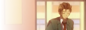 as the background. For the older version, it would be
  or, if I didn't modify as a result of the recent resizing of square thumbnails,
  . Notice the gradual transparency. As there are some problems with the colour scheme with these new images, I might need to do some adjusting or even replace with new ones. I might also have to remove the borders and that background colour when hovering over text links anywhere on that page.
If you didn't know, that image is from the infamous "WASUREMONO" scene:
 It's been some days since then. I have found out that the width of 170px is not enough. Also, some of the images used don't seem right due to the area cropped. It's hard to judge what size would fit nicely, so I might use the version used on the drawings blog as that has the largest width and height.
I don't count the blog to test the layout though, but I might use that to preview changes of my widgets written in code without risking accidental changes, which has happened before, and easily apply it. It's also where I would construct new blog layouts for existing blogs, along with elements such as text/HTML widgets.
I don't really know how to come up with a new design for the menu, because the current one is meant to replace an earlier version that has its limitations. The current one is done through trial & error to what you see now. There are, however, minor variations. The red version you see on my main blogs is to match the colour of the blog, but it didn't look quite well.
Also, those new images also seem to make the menu look worse, but that could be because of the colour scheme. I might remove the background colour when a link is hovered over, because it now makes the link on the menu ugly. As for the border, I'm not sure.
Since I have so many things to do, my priorities for this is low, though I might make gradual changes.
As for the colour scheme used in the testing blog, I don't have plans to apply it to anywhere. Just wanted to see if the colour combination and font usage I saw in a visual novel would fit in nicely.
On some of my blogs, I have changed the images with this new style. I wanted to do this earlier, but didn't know how. Turns out that I could use an image-editing software that has been installed on the computer, but rarely used, to do this (GIMP). All the time, I was trying to see if the program I had always been using (Inkscape) has this feature. I still need the latter program for sizing and cropping to the exact dimensions though.
For example, if you were to hover over "Anime", the new version should display
as the background. For the older version, it would be or, if I didn't modify as a result of the recent resizing of square thumbnails, . Notice the gradual transparency. As there are some problems with the colour scheme with these new images, I might need to do some adjusting or even replace with new ones. I might also have to remove the borders and that background colour when hovering over text links anywhere on that page.If you didn't know, that image is from the infamous "WASUREMONO" scene:
 It's been some days since then. I have found out that the width of 170px is not enough. Also, some of the images used don't seem right due to the area cropped. It's hard to judge what size would fit nicely, so I might use the version used on the drawings blog as that has the largest width and height.
I don't count the blog to test the layout though, but I might use that to preview changes of my widgets written in code without risking accidental changes, which has happened before, and easily apply it. It's also where I would construct new blog layouts for existing blogs, along with elements such as text/HTML widgets.
I don't really know how to come up with a new design for the menu, because the current one is meant to replace an earlier version that has its limitations. The current one is done through trial & error to what you see now. There are, however, minor variations. The red version you see on my main blogs is to match the colour of the blog, but it didn't look quite well.
Also, those new images also seem to make the menu look worse, but that could be because of the colour scheme. I might remove the background colour when a link is hovered over, because it now makes the link on the menu ugly. As for the border, I'm not sure.
Since I have so many things to do, my priorities for this is low, though I might make gradual changes.
As for the colour scheme used in the testing blog, I don't have plans to apply it to anywhere. Just wanted to see if the colour combination and font usage I saw in a visual novel would fit in nicely.


Comments