how this blog is displayed in various browsers
(YouTube video is unrelated to this post, but it is for another)
I can't help but notice that this blog is rendered differently on the same PC & OS, but different internet browsers. Here's a screenshot of the area below the blog title and just above the content of the previous post that I made to compare:
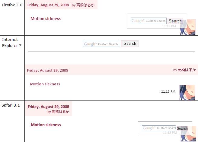
The one that seems to render the page the best is Safari while the worst is ironically IE7, though Firefox would have the fonts displayed similar to the operating system. You can tell by just looking at the text, smoothness of the edges of the avatar, and the position of the search box.
On top of that, you would also notice that "by 高橋はるか" (me) is positioned differently.
- IE7: at the right-hand-side of the post
- Firefox 3: just next to the date
- Safari 3.1: on the right at the line below the date
I honestly don't know which is the "correct" one, but Safari seems to do better in the Acid3 Test. The Opera browser is the closest to getting the full marks.
Oh, and here's an enlarged and modified version of a vector I did recently:


Comments